"Good" and "Bad" Data
Exploring data is something that comes up in our everyday lives. We view statistics of sports teams, use data in math and science, and hear stories of collected data on things like the news all the time. So considering that we hear, see and collect data all the time, how are we suppose to know if that data is valid, or just misleading?
We should always analyze our data, because you never know if what you are reading is true. Now, what makes data "good" data? When looking at a set of data or even a graph, you must make sure that you are able to comprehend the data. If it is easily understood, it is possible that the data could be accurate. Also make sure that the data is valid and relevant. Ask yourself, is this information plausible? Does it make sense? Is it possible for grandma to live to age 120? Or, does 101 sound more realistic? When it comes to graphs, always check that the axis are labeled, and that they correspond in some way. Also, consider the scale of the graph; make sure that numbers aren't being skipped or blown out of proportion.
What data would be considered "bad" data? If your data is missing parts, you know the data is bad or misleading. For example, if the data for year 7 was completely skipped over for a data set of a 10 year period, the data is misleading. Other examples of misleading or inaccurate data is graphs or data sets that make one group look better than another group; making insignificant things seem like a big deal. Also, manipulating the scale or the axis of a graph to minimize or maximize change in a data set is another form of misleading visuals that are considered bad data.
source:http://www.statisticshowto.com/misleading-graphs/
Take a look at this graph! By the looks, the graph makes the democrats look like they voted a lot more than the republicans and the independents, but taking a closer look at the scale, it looks like there is only about a 14 percent difference in the votes! This is an example of a misleading visual because the scale is manipulated and makes one group look better than the others.
source:http://www.statisticshowto.com/misleading-graphs/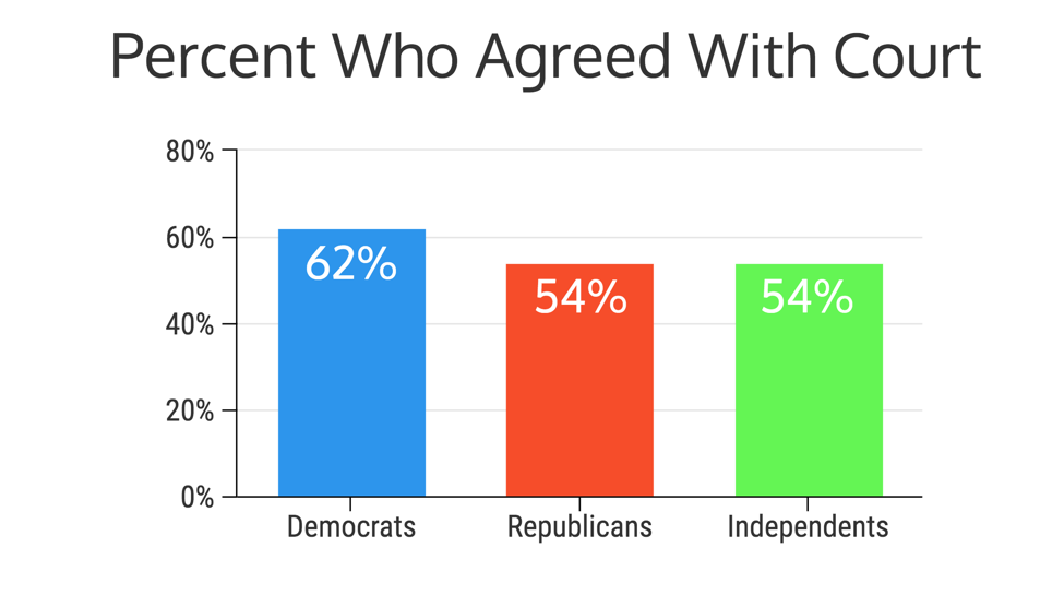
Now take look at this graph! This graph is representing the same data as represented above, but changed in some ways. The biggest change in this graph from the first graph is that this graph's scale is more reliable, showing a more accurate representation in the difference in the two parties.
The only knowledge I have of illustrating data is what I have learned through school. When it comes to representing data, I've always been taught to place the data in an organized chart. When it comes to displaying data, there are many types of graphs that can be used according to the type of data you are collecting. No matter what type of graph you are using to represent your data, always include a title of what is being displayed, a x-axis label and ay-axis label, and a key, if you are sticking to the basic rules of displaying data in a graph.
My topic for our final project is Alternative Medications. So basically, I will be looking at other types of natural remedies or other alternative medications that treat certain things, and compare them to how actual medication.


My topic for our final project is Alternative Medications. So basically, I will be looking at other types of natural remedies or other alternative medications that treat certain things, and compare them to how actual medication.
https://nccih.nih.gov/research/statistics/2007/camsurvey_fs1.htm
Here is an example of a bad graph for my topic. Yes, it includes a title and percentages but the consistency of the graph is not good. First off, the year starts in 2002, and then automatically skips to 2007, which leaves out a lot of years in between that could have quality data to compare to the other years listed, but it doesn't. Also, if the graph is going to represent adults in both 2002 and 2007, they should include children in 2002 as well, for comparison; there is nothing for us to compare the percentage in 2007 to for children.
https://nccih.nih.gov/research/statistics/2007/camsurvey_fs1.htm
Now here is a better representation of a graph for Alternative Medications. CAM, as seen in the title, stands for Complementary and Alternative Medicines. Here the graph is displaying all ages that have used alternative medications in the year 2007. Unfortunately, this is not they best graph; not all the axis are labeled, but the graph does a better job than the other graph of representing ages.


This is a good example of how a graph can be made unbiased by simply changing a few characteristics. Good commentary as well
ReplyDeleteMaddie, this is a good start but you were supposed to find good and bad examples of graphs related to your final topic. Reread the guidelines for the blog post on ASU learn and add a couple of specific graphs below, with a brief discussion.
ReplyDeletePlease address this feedback and make the necessary additions so I can give you the full score for the assignment
DeleteThese are some really engaging graphs. You did a really good explaining each of the graphs and what is wrong with them.
ReplyDelete